
The best fonts for a CV are those that present you in a professional light and allow the recruiter to locate the essential information at first glance. As a result, these fonts must be readable, clean, and simple, even if that means compromising creativity and originality.
In this article, we will introduce you to the best fonts for a CV in 2025, show you how to format your application document, and review some of the worst options.
Let’s start!
Key Takeaways
The best fonts for a CV are clean, readable, and professional—for instance, classics like Arial, Calibri, Verdana, and Times New Roman.
The best font size for a CV is between 10 and 12pt, while headings can be in the 12–16pt range.
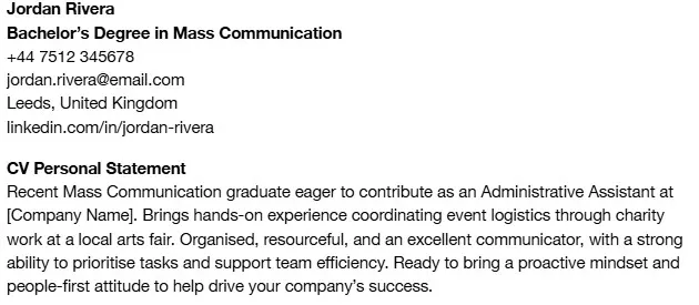
Choosing the best font for your CV and formatting it properly is crucial because this document acts as an introduction to your potential employer and can make a difference in whether you get hired.
You should avoid overly stylised fonts, as well as those that are commonly used in comics or online spaces. These usually come across as unprofessional or unserious.
15 Best Fonts to Use for a CV
Before we explain what the best fonts to use for a CV are, note that there are two types to choose from—serif and sans serif. Both can be perfectly acceptable choices, though they are often used for different kinds of applications.
Serif fonts, with decorative “tails” and “feet”, are traditional and sophisticated. Due to their elegant look, they are suitable for business, accounting, law firms, corporate roles, and any other highly formal position.
On the other hand, sans-serif fonts, which possess no decorative elements, are minimalistic, modern, and clean. As such, they belong in applications for tech jobs, startups, and other more contemporary job positions.
That said, let’s take a look at what the best fonts for CVs are and how to use them to their full potential.
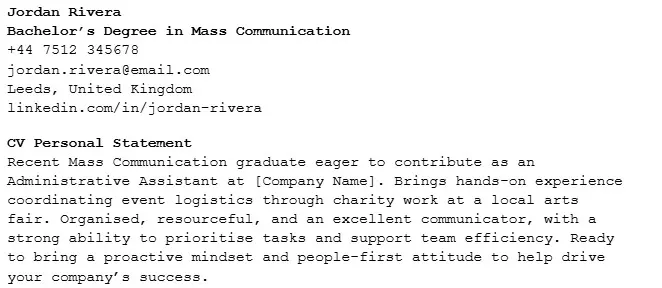
#1. Arial
Let’s start with the basics and review Arial—the default Google Docs font frequently used on websites or in academic settings. Clean, modern, and easy to read, Arial is one of the most popular CV fonts, particularly in IT, design, and other creative fields.
However, some may argue that Arial is too safe a font. Most candidates opt for it, so your CV isn’t likely to stand out from the crowd as it would with a bolder choice. But remember, it’s your unique experiences and skills that truly make your CV stand out. Arial works most of the time, so don’t hesitate to use it!
#2. Calibri
Calibri is another well-known font commonly encountered in Microsoft Office, where it is the default. It is somewhat smaller than Arial but just as legible, modern, and clean, making it an excellent choice for most professional documents.
This is particularly true for documents in digital form, as Calibri was created specifically to be readable and visually appealing on screen. It performs well on paper, too, so you can use it regardless of the kind of application you’re submitting.
#3. Times New Roman
The first serif font on this list, Times New Roman, is a timeless classic, which appeared in the Times of London newspaper in 1932. Since then, it’s become one of the most recognisable and widely used fonts, both in print and on screen.
As a result, Times New Roman can give your CV an elegant, professional feel suitable for traditional careers in law and business. Though it can also be used on applications for startups and forward-thinking companies, it can appear a little dated, so it’s best to use a more modern font instead.
#4. Verdana
Due to its larger letter size and wider spacing, Verdana is one of the most legible fonts for a CV. In fact, the designers have taken particular care to distinguish commonly confused letters and ensure a smooth and pleasant reading experience. Furthermore, its size and spacing can help your CV appear longer and richer with content than it is. This can be particularly useful for fresh graduates with little work experience, who might not have much to fill their applications with.
#5. Helvetica
Helvetica is a sans-serif font reminiscent of Arial but somewhat larger and less condensed. Developed by Swiss designers, it was one of the most popular fonts of the mid-20th century, and it is still widely used in CVs for creative fields.
Unfortunately, Helvetica isn’t free for Windows, so it might be more difficult to obtain than other fonts. You can use it on Mac, though, or replace it with one of the Arial fonts.
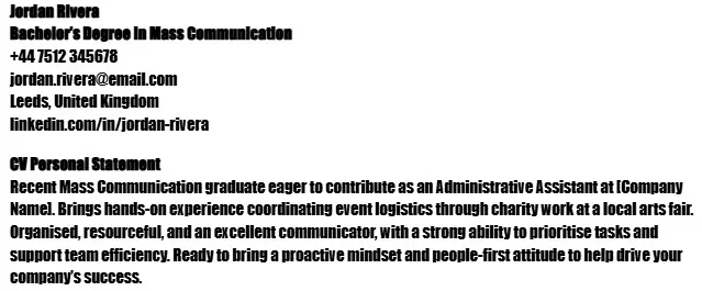
#6. Georgia
Georgia is a serif font that resembles Times New Roman, though it is larger and wider. As a result, it can be used as Times New Roman—as a professional font for CVs submitted to law firms, corporations, and government institutions.
It’s worth noting that Georgia has been the official New York Times font since 2007, meaning that it’s proven itself in professional environments. Thus, it’s likely to attract recruiters’ attention and give your application a simultaneously traditional and contemporary feel.
#7. Garamond
Garamond is striking and often used by people who want an elegant, classic font that’s not quite as widespread as Times New Roman. It has a centuries-long history—the current font was inspired by typefaces from the 16th century.
Though Garamond is commonly used in books, it’s also an excellent font style for CVs. It combines the classic serif appearance with an air of informality, making your application suitable for traditional roles and modern workplaces.
#8. Cambria
Popularity-wise, Cambria can easily measure up to Arial, Times New Roman, and Calibri. This font, developed specifically to look good on screen or printed in small sizes, is widely used as a body text and a font for typing software.
One of the best fonts for a CV, Cambria, is suitable for various purposes, including business texts, math symbols, and science formulas. Its versatility makes it particularly beloved among job applicants—no matter what position you aim for, Cambria is always an excellent choice.
#9. Trebuchet MS
Trebuchet MS, a sans-serif font designed for various screens, became an instant classic when it was launched in 1996. This font immediately stands out among other sans-serifs, infusing your CV with personality and originality.
As such, Trebuchet MS should be primarily used by designers, writers, and other pursuers of creative career paths. It can, of course, be used when applying to more traditional positions, but it may be less successful at landing you a job in a law firm than in a modern marketing agency.
#10. Tahoma
Tahoma shares many similarities with Verdana—the two fonts look almost identical, but Tahoma is narrower and more condensed. Initially, it was designed for Microsoft and used as a computer font, so it’s still the best one for technical CVs. However, its versatile design makes it an ideal choice for a variety of applications.
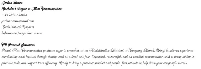
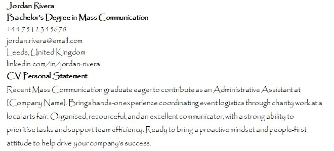
#11. Didot
Didot is another elegant serif font, best for CVs that need to capture attention and stand out. In particular, this font is used for fashion or photography applications, as it demonstrates your taste and sense of style.
However, Didot’s downside is that it’s complex and somewhat less readable than other professional fonts. This shouldn’t impact your application’s performance significantly, though, as Didot is still one of the best fonts for a CV, but it’s something worth keeping in mind.
#12. Book Antiqua
Book Antiqua is based on pen-drawn letters of the Italian Renaissance, so it’s refined and gentle in a way many other fonts aren’t. As a result, it’s ideal for creative fields but also has its place in law, business, and political sciences.
There are many versions of the Book Antiqua font—one of them, called Book Antiqua Parliamentary, is used by the UK Parliament. This version isn’t available for public use, but there are many free options that are.
#13. Arial Narrow
Arial Narrow is essentially the same font as Arial but far more condensed. This affects its readability to a degree, yet simultaneously allows you to include more text in your application without going over the two-page limit. As a result, Arial Narrow is undoubtedly one of the best fonts for a CV out there.
#14. Constantia
Constantia is similar to Cambria, possessing only a few minor differences—rounded letters, for instance. This is enough to make a unique impression, especially because Constantia isn’t used as frequently and may make your application stand out more.
#15. Gill Sans
Last but not least is Gill Sans, one of the best fonts for various job applications, ranging from scientific to creative fields. First developed in 1928, Gill Sans is older than it looks—its simplicity and modernity usually place it in the digital era, although it was made long before that.
As a testament to that, this font is often encountered in advertising, on labels, or in magazines that use contemporary design to captivate their readers.
What Is the Ideal CV Font Size?

The ideal CV font size is between 10 and 12pt for body text, but the exact number depends on the chosen font, the amount of text, and the overall design of your document.
For instance, some fonts are smaller and may be more difficult to read in 10pt, while others may seem too big and clunky in 12pt. In other words, you must adjust the size according to the font to achieve maximum legibility.
Also, if you don’t have much text, it’s good practice to write your CV in a larger font size to make it appear longer. The opposite is also true—smaller font sizes allow you to include more information without cluttering your document.
As for headers and section titles, you should increase their sizes to anywhere between 12 and 16pt. That way, they will stand out from the rest of the text and indicate where a specific section begins, making your entire application more readable.
Finally, you can emphasise your name with an even larger font size of 20–24pt.
How Should CV Font Be Formatted?
Picking the right font is only one aspect of formatting your CV correctly. You still need to consider whether and what you should bold or italicise, which font colour to choose, what margins to use, and more.
With that in mind, here are some simple CV formatting tips:
CV Formatting Tips
Don’t overuse bold or italics. Bolding or italicising certain parts of your CV to make them stand out is recommended, but don’t go overboard. Your document might end up lolookd unprofessional rather than impactful and eye-catching.
Stick to black font. The safest colour combination is black letters on a white background, so it’s usually best to use that. If you want to experiment, though, you may try other combinations, but make sure there is enough contrast—dark colours on white or white font on coloured background.
Don’t capitalise letters unnecessarily. Writing words or sentences in all caps may sound like yelling, which is certainly not what you want to do in your CV. So, avoid using capitalisation for emphasis—that’s what bold and italics are for.
Aim for 2.5 cm margins. Larger margins might overemphasise the white space in your CV, while smaller ones may make it look too busy and cluttered.
Why Is Choosing the Right CV Font Important?
Choosing the right CV font is important because your CV is the first contact recruiters have with you. In other words, this document must capture their attention and present you in the best possible light: as a competent professional who takes their job seriously.
On top of that, many companies use applicant tracking systems (ATS) to scan CVs before picking out the ones that suit their requirements and sending them to recruiters. If your CV uses an unreadable font, the software might not be able to pick up on the relevant keywords, leading to automatic disqualification.
Similarly, a hiring manager is unlikely to bother deciphering an illegible document to find the information they need. It’s best to present everything as clearly and straightforwardly as possible to ensure that even a recruiter who only skims your CV can gain an understanding of your professional qualifications.
5 Fonts You Should Avoid Using on a CV
The fonts you should avoid using on a CV include those that are unprofessional, over the top, or hard to read. These include Comic Sans, Courier, script fonts, Papyrus, and Impact.
Now, we’ll take a closer look at these fonts.
#1. Comic Sans
Comic Sans may be widely beloved online, but it isn’t appropriate for CVs and professional applications. It’s typically associated with comics and memes, so recruiters might be under the impression that you’re not taking the job-hunting process seriously.
#2. Courier
Courier was initially designed for typewriters, which is apparent from its style and format. Unfortunately, while using this font in informal texts may be fun, it’s too clunky and wide to look good on professional documents.
#3. Script
Script fonts generally don’t align with the UK CV font standards—they are highly stylised and very difficult to read, so most recruiters immediately reject applications using them. They also come across as unprofessional to a greater or lesser degree, depending on the specific script font.
#4. Papyrus
Because of its unique design and fun feel, Papyrus often has a special place in popular and internet culture. However, it is completely unfit for a CV—most recruiters would take one look and decide that you’re not being serious about your application.
#5. Impact
Impact is big, boxy, and bold—perfect for large, bombastic headlines. It isn’t suitable for CVs at all, though, as it is difficult to read and appears messy in smaller sizes.
Create Your Professional CV
If you need help creating and formatting your application document, use our professional CV maker to design one that will catch a recruiter’s attention. The whole process takes less than 15 minutes—just follow our instructions, fill in the information, and download your new job-ready CV.
Final Thoughts
Now that you know what the best fonts for a CV are, you can make better decisions when formatting your application document. Choose the font that suits the impression you want your CV to leave, and you’ll likely land the job of your dreams.
If you need any help, take a look at the CV formats available on our website and use them as inspiration. You can even pick the one you like the best and edit it to create a perfect document on the spot.
Best Fonts for a CV FAQ
#1. How can I choose a font for my CV?
You can choose a font for your CV by examining the commonly used ones and trying out those that catch your interest to see how they fit your application. Readability and simplicity should be your primary concerns, but you should also consider what impression you’d like to leave on your potential employer.
#2. Do different industries prefer using different fonts for CVs?
Some fonts may be more suitable for specific industries than others, but generally speaking, all of the best fonts for a CV we’ve listed above can be used on any application. Still, to be safe, you can use elegant serif fonts for traditional companies and government institutions and modern sans-serif fonts for innovative startups.
#3. Do fonts affect applicant tracking systems (ATS)?
Fonts affect applicant tracking systems due to their legibility or lack thereof. For instance, script fonts are usually difficult to read, so an ATS scan may not be able to recognise the required keywords. So, to ensure your font is ATS-friendly, choose a clean and readable one.
#4. Should I use different fonts for headings and body text on my CV?
You can use different fonts for headings and body text on your CV to distinguish the sections, but you can also stick to one and try it in different font sizes. If you opt for the former, make sure the difference isn’t too distracting—you want your employer to read your CV, not wonder about your formatting choices.

